Heritage Red
A confident anchor shade for recognizable Stanley displays, seasonal gifting, and bold single-product choices.
Color and material studio
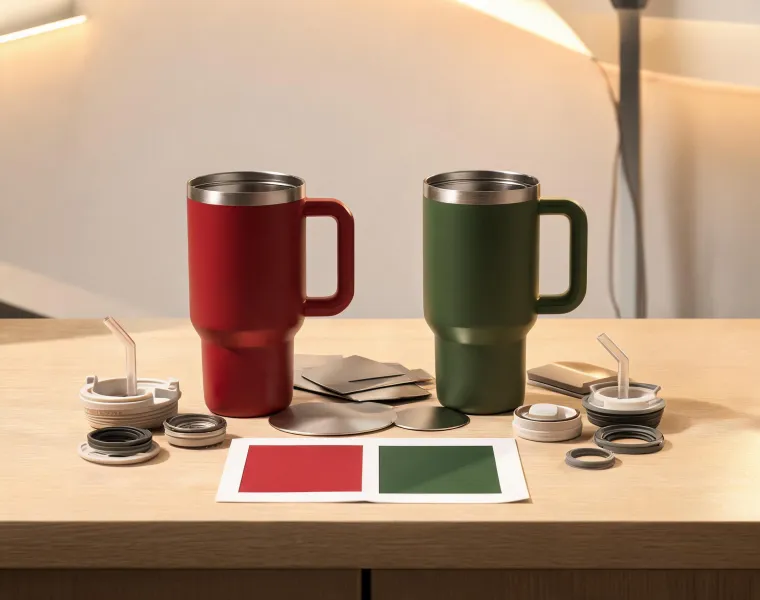
Study the shades, finishes, lids, and material choices that make Stanley drinkware feel coordinated across daily routines, gift programs, and retail displays.
Color library
Stanley color planning begins with the way drinkware is actually seen: beside black coffee, clear water, table linens, backpacks, outdoor gear, stainless appliances, and neutral ceramics. A shade has to look good in a product photo, but it also has to behave in a kitchen sink, a cupholder, and a gift basket. That practical view keeps the palette disciplined.
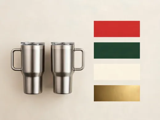
A confident anchor shade for recognizable Stanley displays, seasonal gifting, and bold single-product choices.
A grounded outdoor tone that pairs well with stainless details, patio textiles, camp tables, and weekday carry.
A quiet neutral for customers who want a tumbler or bottle to sit comfortably among tableware and soft kitchen finishes.
A small premium highlight used for labels, icons, and display details rather than large surfaces.
Stainless steel should look strong without feeling clinical. Stanley balances brushed highlights, matte finishes, and color coating so a product can move from a work counter to a dinner table without looking misplaced. The studio evaluates reflection, edge contrast, grip feel, and the way a finish frames the lid because each detail influences perceived quality before the first sip.
A lid is the part customers touch most, so it needs to communicate quickly. Straw access, sip openings, gasket placement, and cleaning paths should feel obvious. The studio reviews how each lid sits visually on the body, how it reads in product imagery, and how easily a staff member can explain its everyday advantage.
Gift-ready drinkware works best when the set feels intentional. A tumbler can be paired with a bottle, a mug can sit beside a compact accessory, and color can shift from bold to neutral inside the same story. The studio uses composition rules so gift groups look composed instead of randomly bundled.
Care and selection notes
Use bold colors when the product is meant to be recognized quickly on a shelf, in a gift program, or in an outdoor setting. Use neutrals when the drinkware needs to blend into kitchens, offices, and hospitality rooms. A balanced Stanley assortment usually includes one confident brand shade, one grounded green or dark tone, one warm neutral, and one limited accent.
Start with the qualities a customer can verify in the store: weight, grip, lid movement, surface feel, and cleaning access. Those details are more persuasive than abstract claims because shoppers can touch them immediately and imagine how the product will behave during a normal day.
Keep the set narrow and purposeful. Pair formats that share a routine, such as coffee mug plus travel tumbler, or water bottle plus handled tumbler. Then tie the set together with a clear shade family, a care card, and a presentation note that explains who the set is for.



Request a studio review
Share the shelf story, room setting, or gift audience you have in mind. The studio team can recommend a tighter palette and a more useful product mix.